01/ Project aim
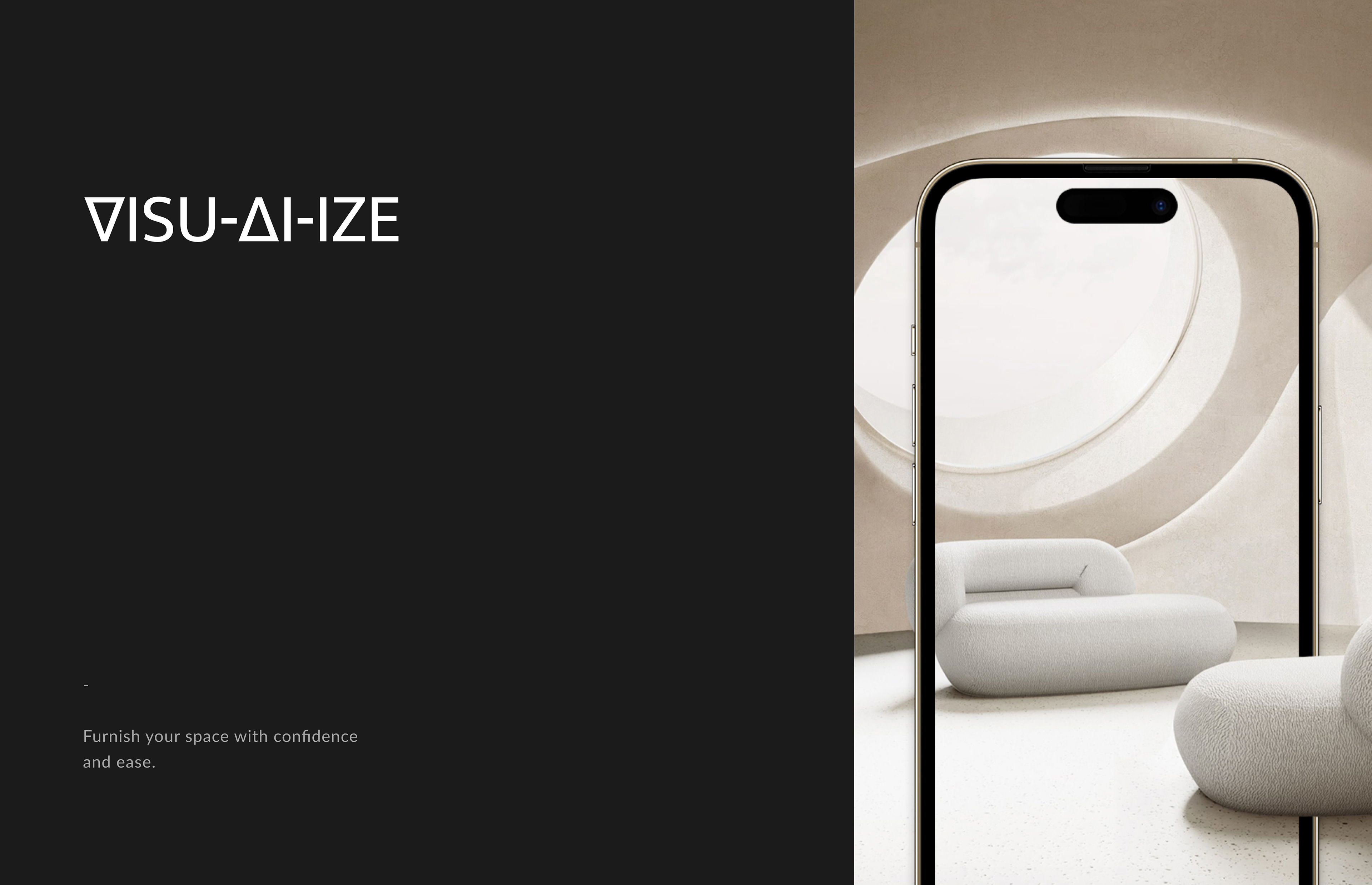
This application strives to offer a unique immersive experience where users can visualise how the furniture of their choice fits into their space, size and lifestyle.
It aims to focus on the relationship of the user and the product as opposed to the product only by itself.
03/ Design Methodology
03.01/ Empathise
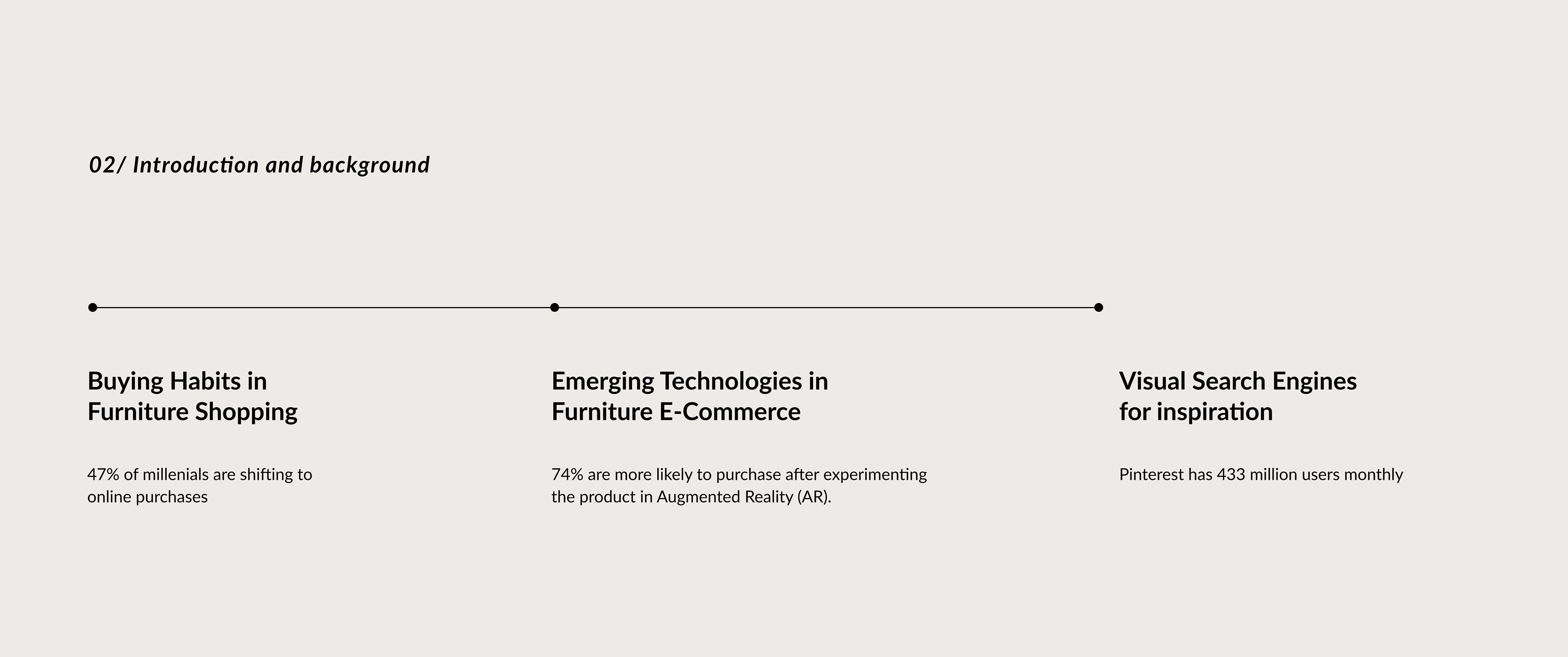
A survey was conducted in order to get quantifiable insights in relation to furniture consumption habits and to gain an overview of the potential users’ thoughts and challenges.
65 survey responses were registered.
65 survey responses were registered.

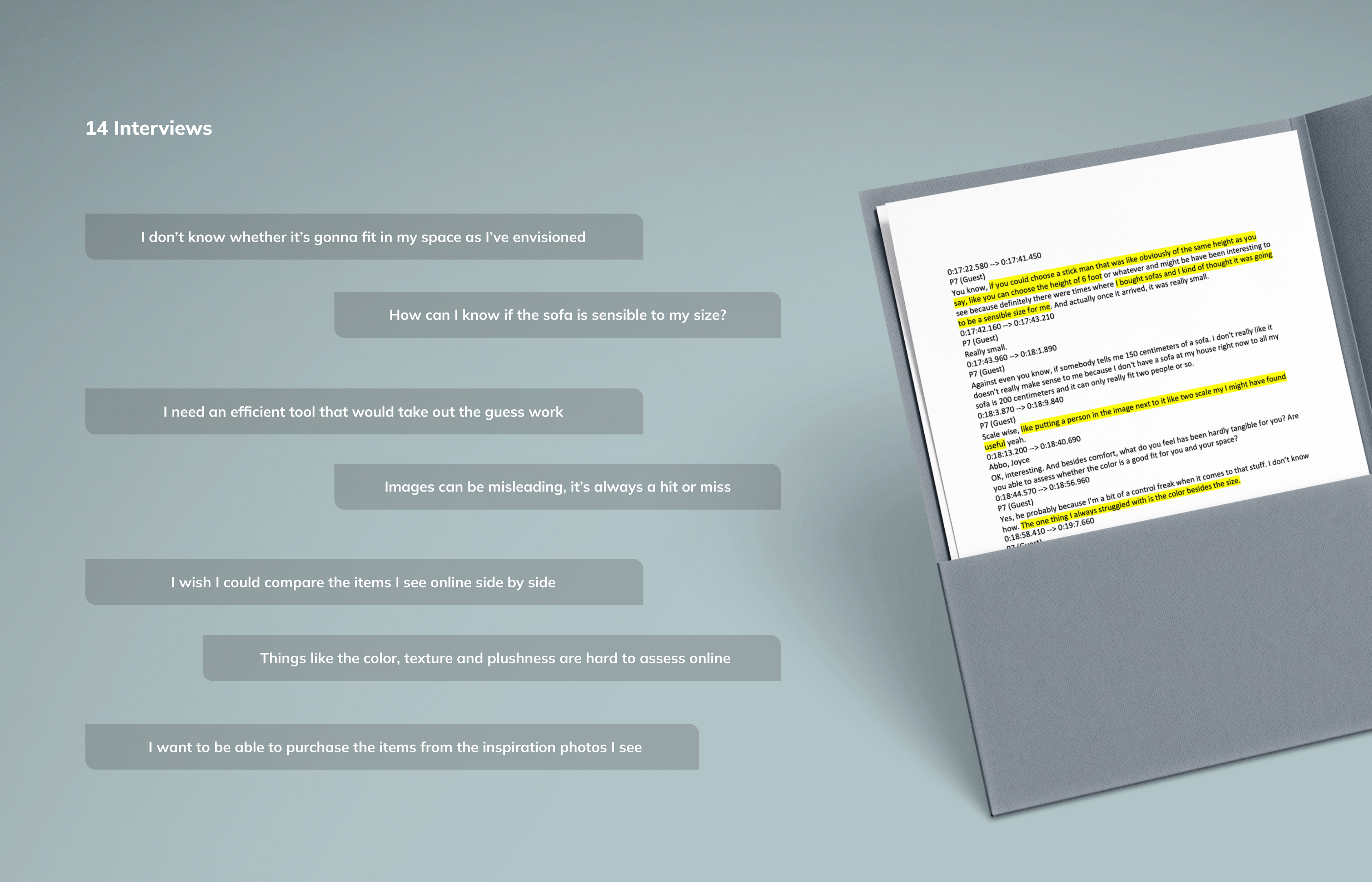
Revisiting the transcripts and cleaning the data allowed to detect two main behaviours among the participants:
- Some individuals have already established a style in their property and are looking to add some pieces matching the decor and colour scheme.
- Other participants are trying to furnish from scratch and are looking to build a style to work with.
- Some individuals have already established a style in their property and are looking to add some pieces matching the decor and colour scheme.
- Other participants are trying to furnish from scratch and are looking to build a style to work with.
Affinity Diagrams
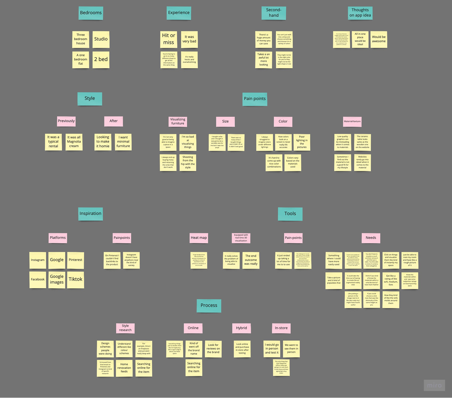
Affinity diagram (1)

Affinity diagram (2)
After organising the clusters of data, it was evident that both behaviours share many similar thoughts and experiences.
Highlights:
03.02/ Define
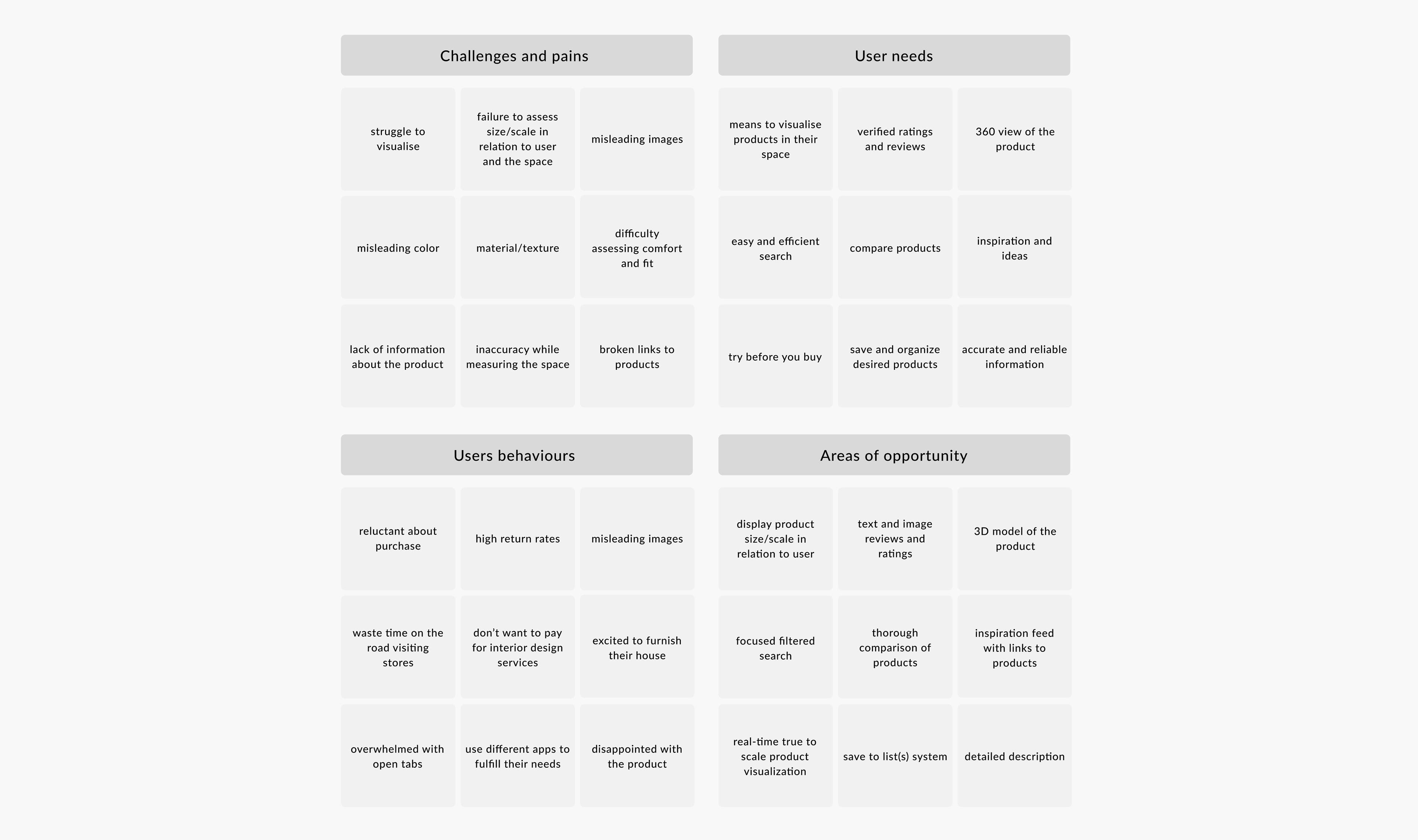
The “Define” stage consisted of collecting, examining and synthesising the data in order to determine the problem and beginning to cast light on areas of opportunity.
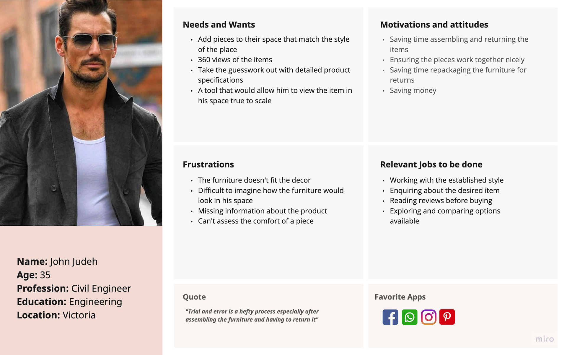
Two Personas were created based on each behaviour that represents a group of potential consumers that was outlined previously.

Persona (1)
Persona (2)
Empathy Maps were necessary to further understand the user and to visually articulate the findings.
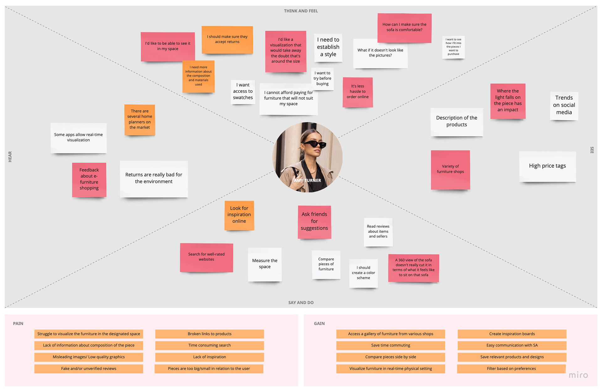
Empathy map (1)
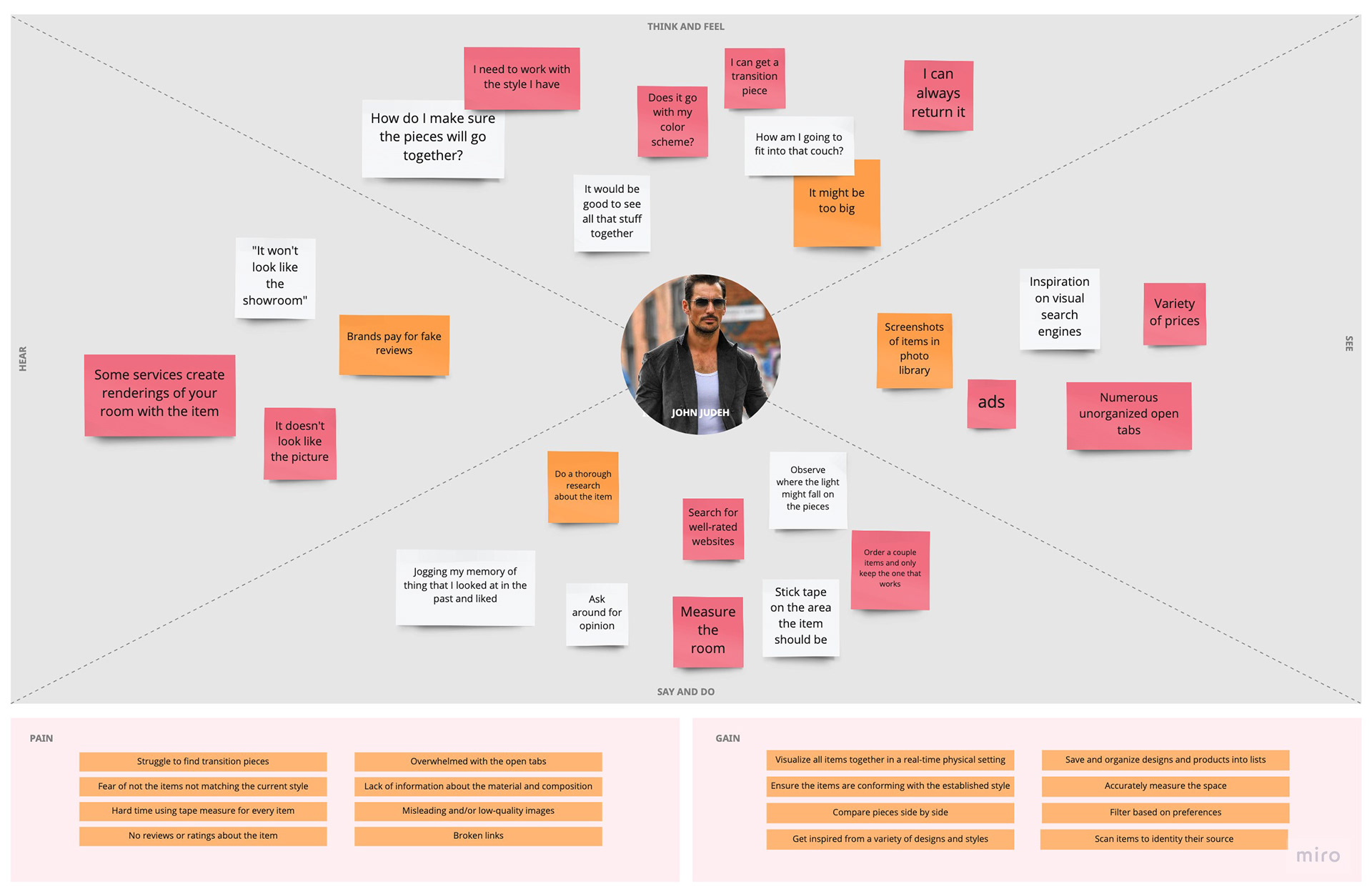
Empathy map (2)
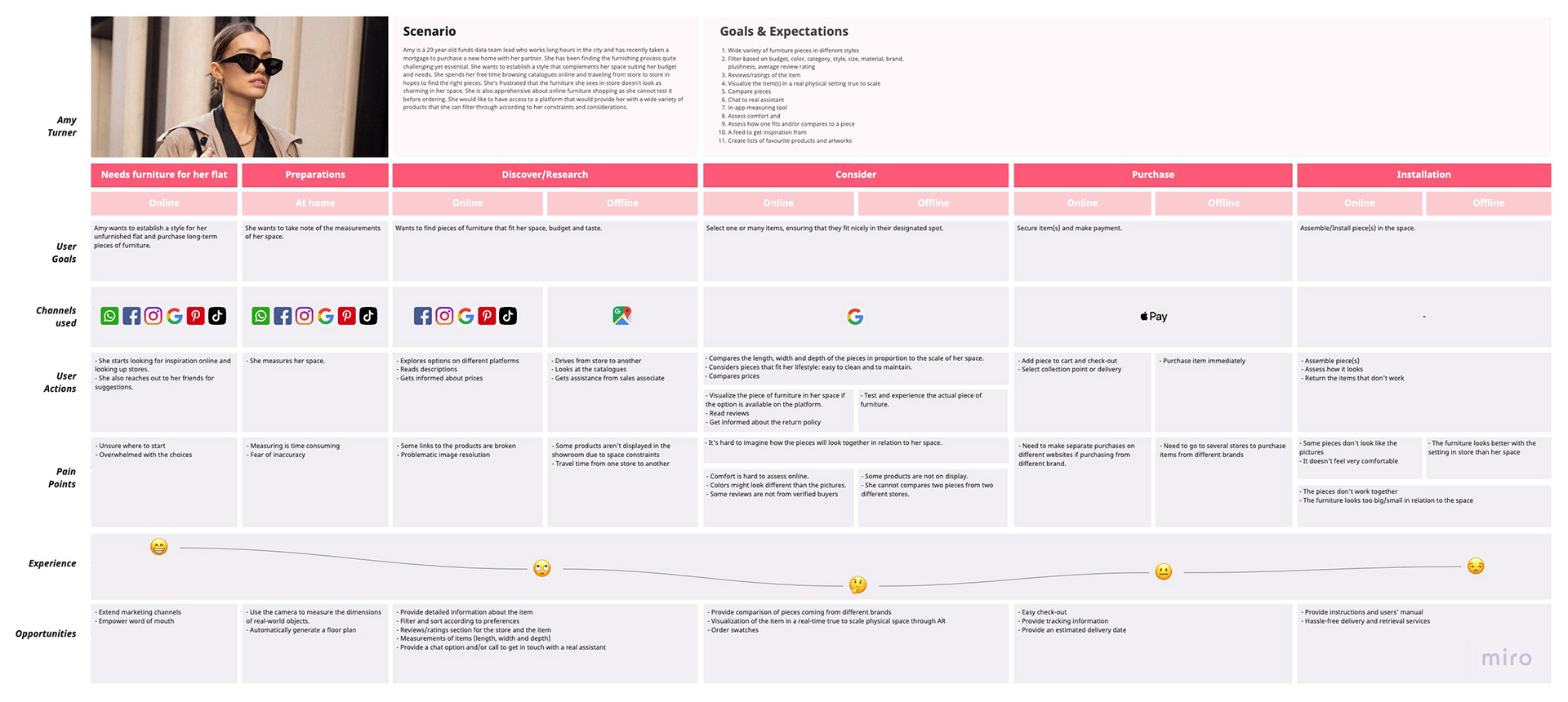
Comprehensive Customer Journey Maps were created for the process each persona undertakes while purchasing furniture. This artefact enabled the user to visualise the experience of the user across all dimensions and touchpoints, mapping out their feelings, needs and frustrations. Thus, discovering areas of opportunity to explore.

Leveraging the research and findings allowed to develop point of view statements (POV) by transforming the identified design problems into actionable statements.
Key POV for Persona 1:
· Amy needs to establish a style that complements her home as she wants to create a functional and relaxed space.
Key POV for Persona 2:
· John needs to find pieces of furniture that work out with his current style at home as he wants to create a functional and harmonious space.
Common POVs for Persona 1 and 2:
· The user needs a big scope of furniture/household listings on a single platform as they don't want to spend time browsing and/or travelling from one store to another.
· The customer needs access to proper information about the product in terms of dimensions, functionality and aesthetics as they dont want to go through the return process.
· They need to consult reviews from other buyers about the store and the product they’re interested in to make informed decisions and avoid bad experience(s).
They need a big scope of furniture/household listings on a single platform as they don't want to spend time browsing and/or travelling from one store to another.
Answering the four fundamental questions “Who?”, “What?”, “Where?” and “Why?” allowed to build a product that resonates for the user by validating ideas.
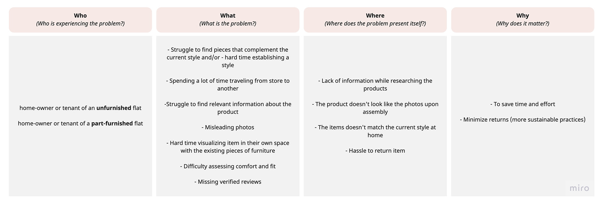
4 W's
Both types of users were facing the same problems except for one:
· Individuals living in an unfurnished flat were having a hard time establishing a style.
· Individuals living in a part-furnished flat were struggling to find pieces that complements their style.
User Stories were created to define the requirements of the end-users in order to come up with the features that cater to their needs. They were then grouped under main themes for more clarity.
Key User Stories are:
Efficient and tailored search to each user:
· As a user, I want to be able to filter my search according to my preferences to effectively browse.
· As a user, I want a personalised inspiration feed to explore designs and products that align with my style.
· As a user, I want to have access to a variety of furniture styles to search through and pick from to weigh my options.
· As a user, I want to be able to make a visual search to find products I've seen around.
Product information:
· As a user, I want a proper description of the product (dimensions, material, caring instructions, assembly etc) to ensure it suits my lifestyle and space.
· As a user, I want to read real reviews about the product for more clarity.
· As a user, I want to view a scale to be able to assess the firmness/softness of a product.
· As a user, I want to work out the size and the scale to know how compatible it is with my size.
· As a user, I want to know what are the product features (extendable, storage, etc) to ensure it fulfils my needs.
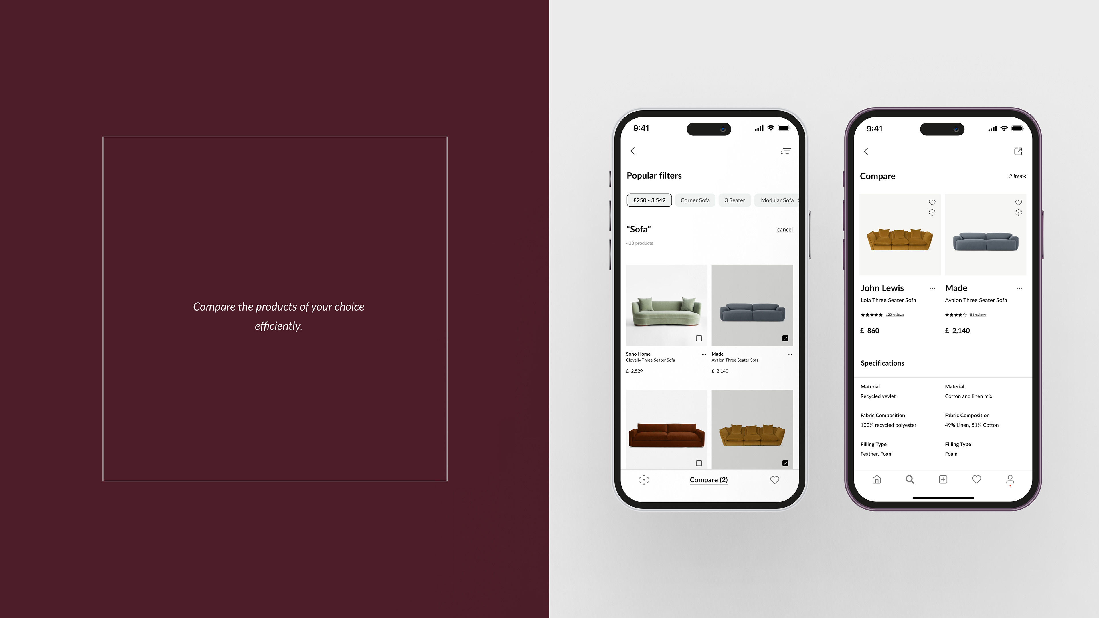
· As a user, I want to have the option to compare products to examine the specifications side by side.
· As a user, I want to be able to speak to a real assistant to further enquire on items.
Lists:
· As a user, I want to be able to save items I'm interested in so I can revisit them in the future.
· As a user, I want to be able to organise my saved items into different folders and search through them to be more efficient.
Creations:
· As a user, I want to be able to work on different rooms in parallel to be able to furnish them simultaneously.
· As a user, I would like to revisit my creations to make amendments if needed.
· As a user, I would like to virtually measure my space and get suggestions of furniture that fits into the designated area.
Visualisations:
· As a user, I want to be able to visualise the product in a real-time physical setting through AR to make sure it fits in my space.
· As a user, I want to be able to populate an image with the products in case I'm not home.
· As a user, I want high resolution images and 360 renderings of the products to make well informed decisions.
03.03/ Ideate
“How Might We” questions were asked to launch the “ideation” phase and creatively innovate on the problems uncovered.
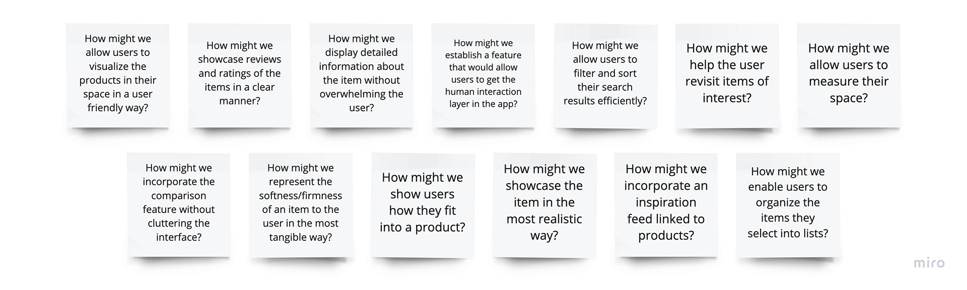
How Might We?
A Competitive Analysis was created to analyze the products on the market and their features. Identifying their strengths and weaknesses allowed to design for an enhanced and inventive product.
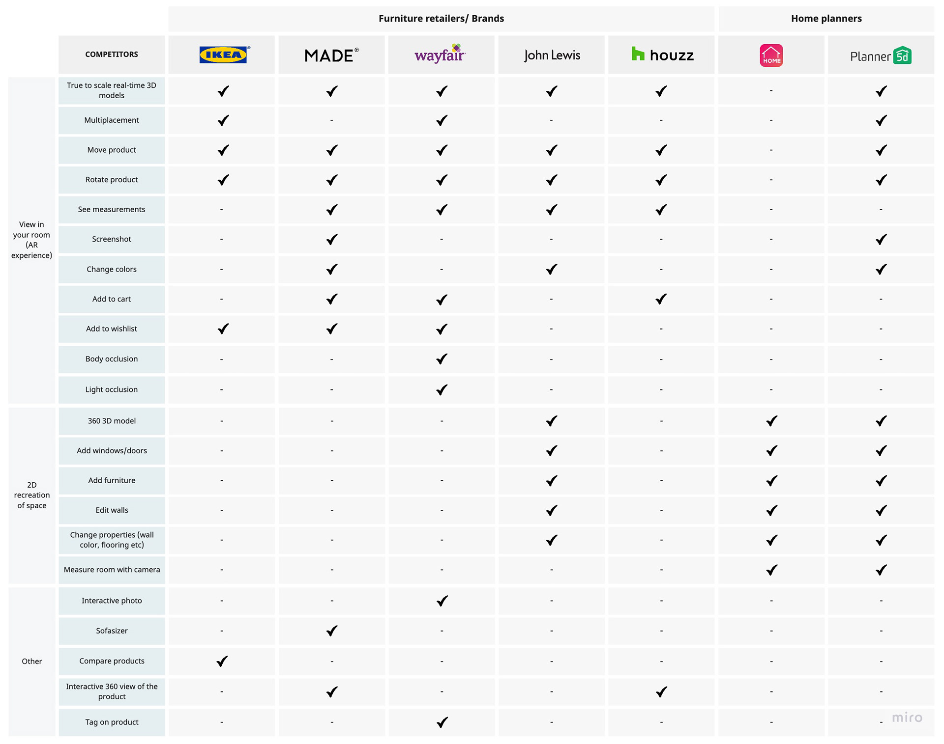
Competitive Analysis
Key findings:
· Apps like Planner 5D and Home Decor do not offer the option of purchasing in-app.
· All the furniture retailers lack the option to virtually measure a space.
· Not all products are available to view in AR.
· Customising the product in AR mode is very limited.
· Only Made and Houzz offer an interactive 360 view of the product.
SCAMPER (Substitute, Combine, Adapt, Modify, Put to another use, Eliminate, Reverse) was used for brainstorming and generating ideas for existing products that were thoroughly analyzed in the competitive analysis. This method provided many insights as to how to improve the products and innovate.

SCAMPER
The main ideas were tested following the NUF (New, Useful, Feasible) criteria to be able to assess them.

NUF Test
03.02/ Prototype
A rough exploration on paper in the low-fidelity prototype allowed the researcher to explore various ways to portray functions. In fact, creating rough sketches allowed the researcher to discover potential solutions in a time efficient fashion.
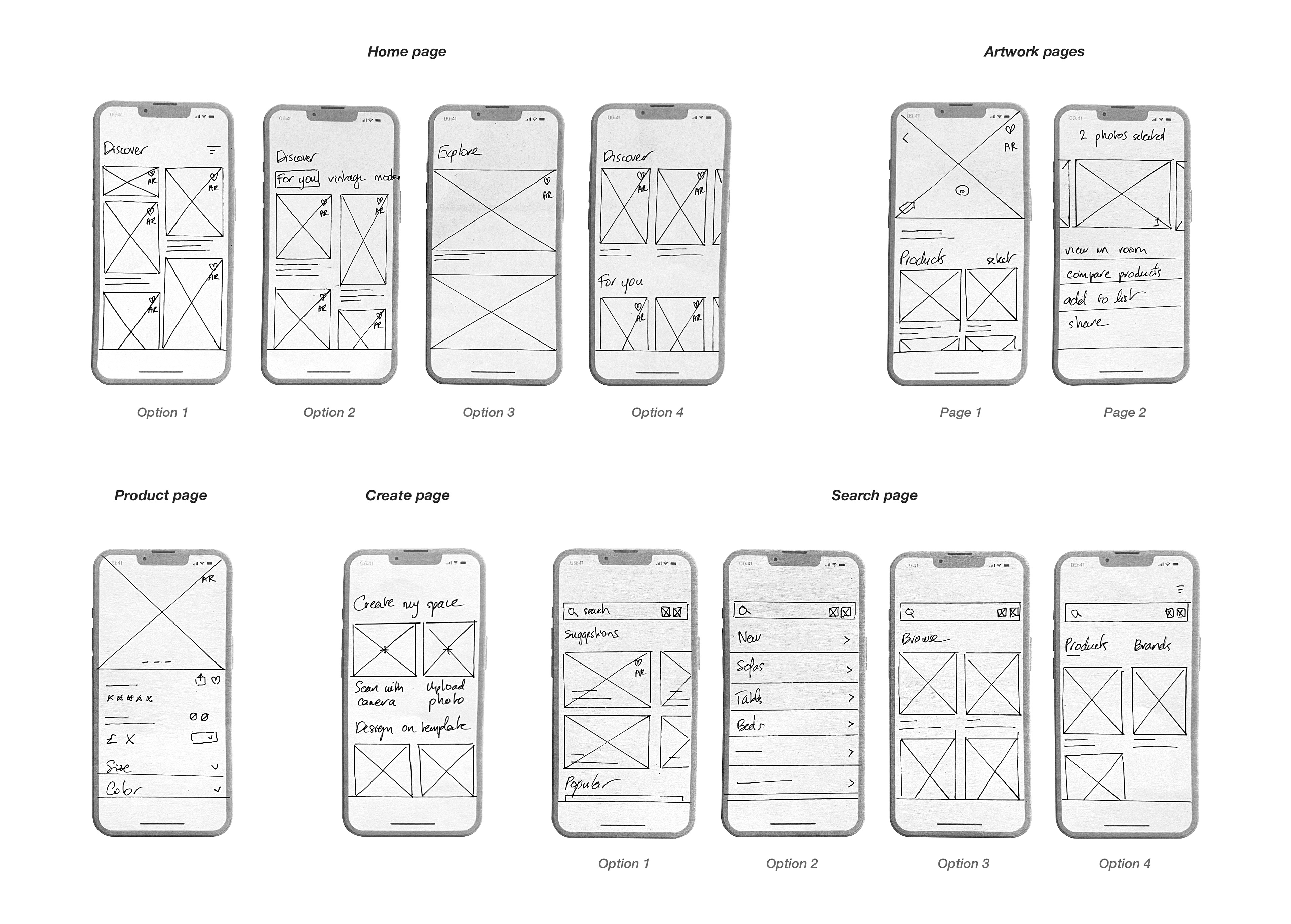
Low-Fi Prototype
After experimenting on paper, the information architecture began to form. The five main components of the main navigation were:
· Home page
· Search
· Create
· Lists
· Profile

Information Architecture
Mid-fidelity frames were designed on Figma to explore the potential navigational possibilities.
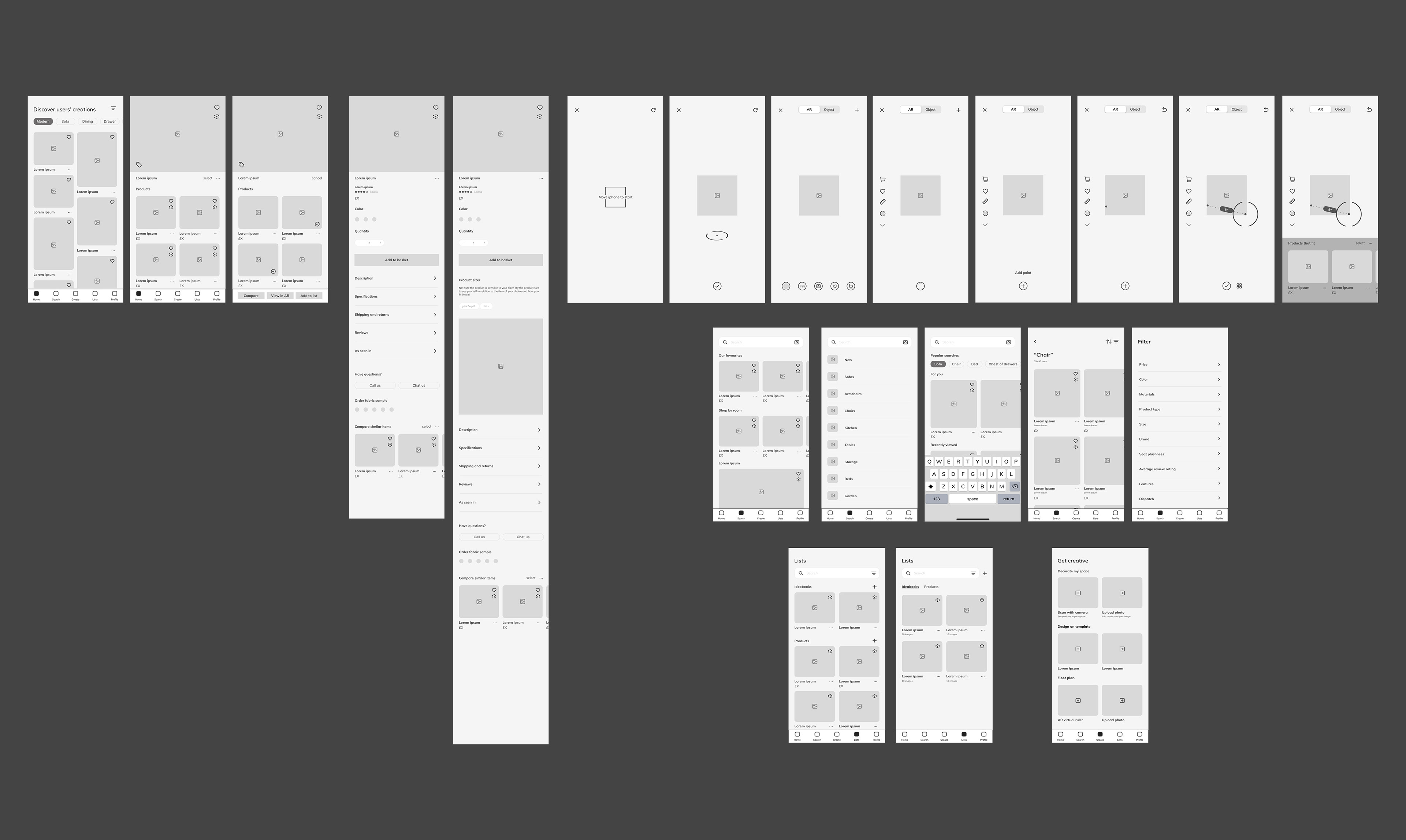
Mid-Fi Prototype
A style guide was created with all the elements that could be used in the prototype to ensure a design system is in place for consistency and coherence.
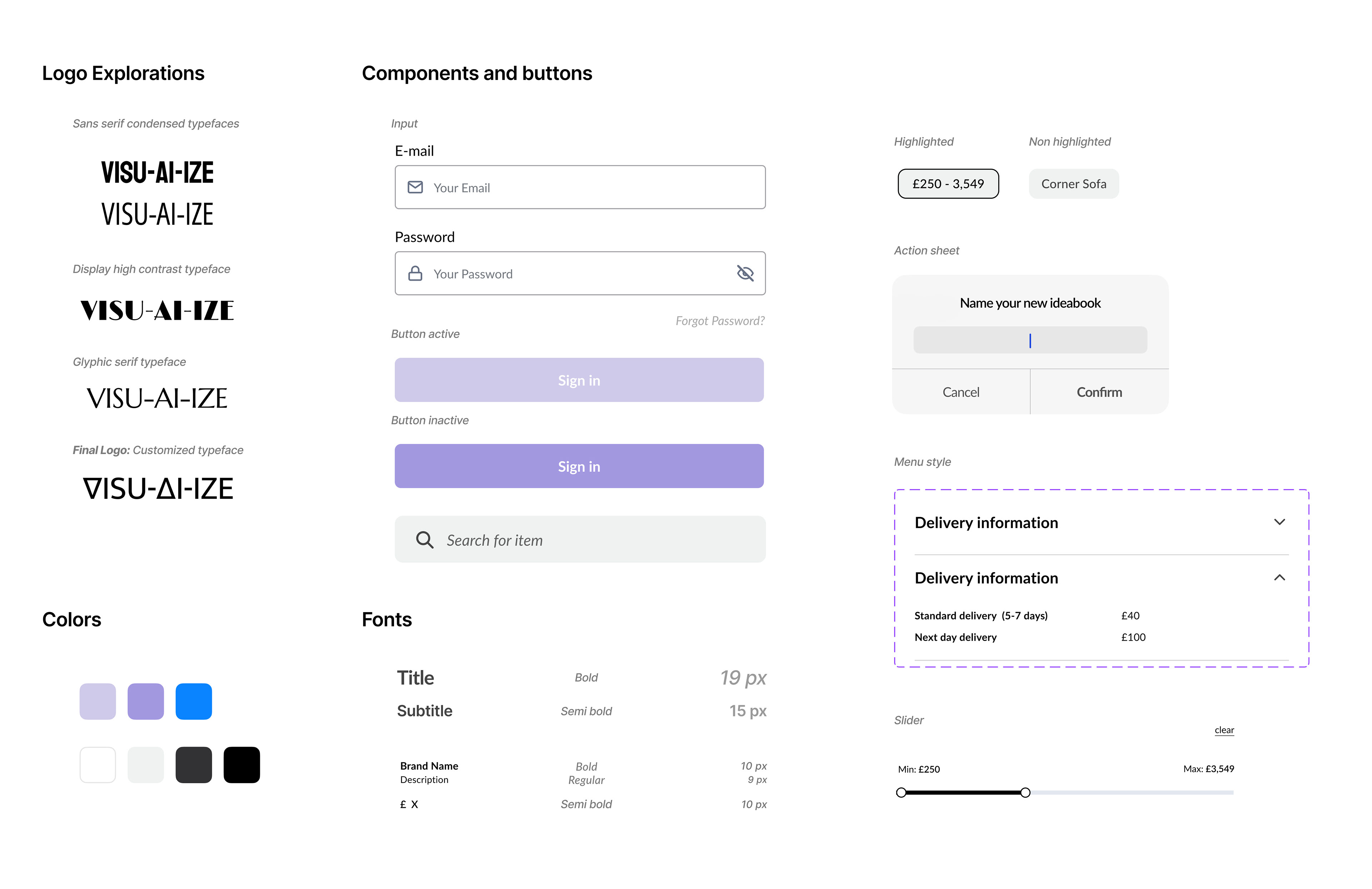
Styleguide
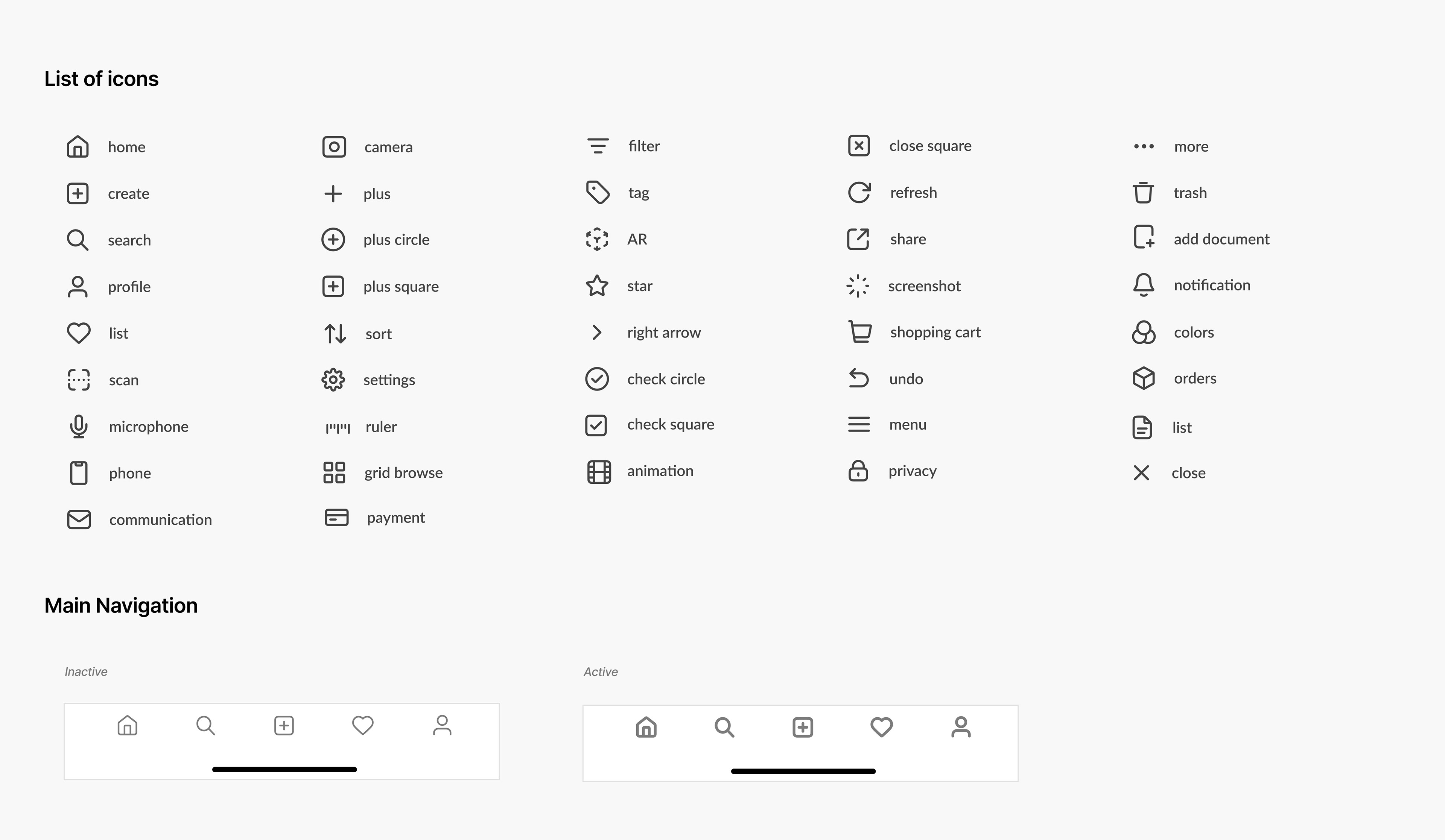
Icons and Navigation

Additional elements and components
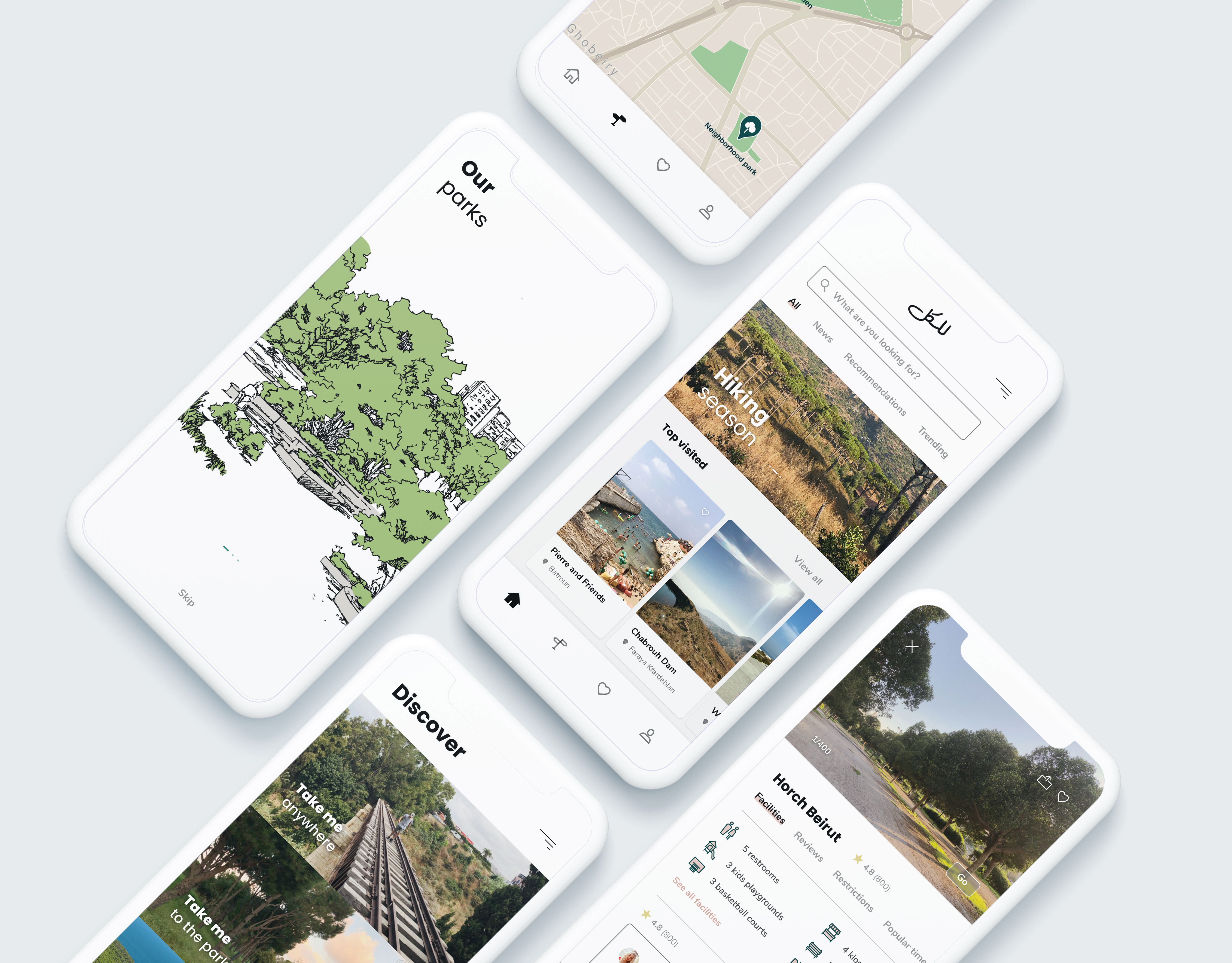
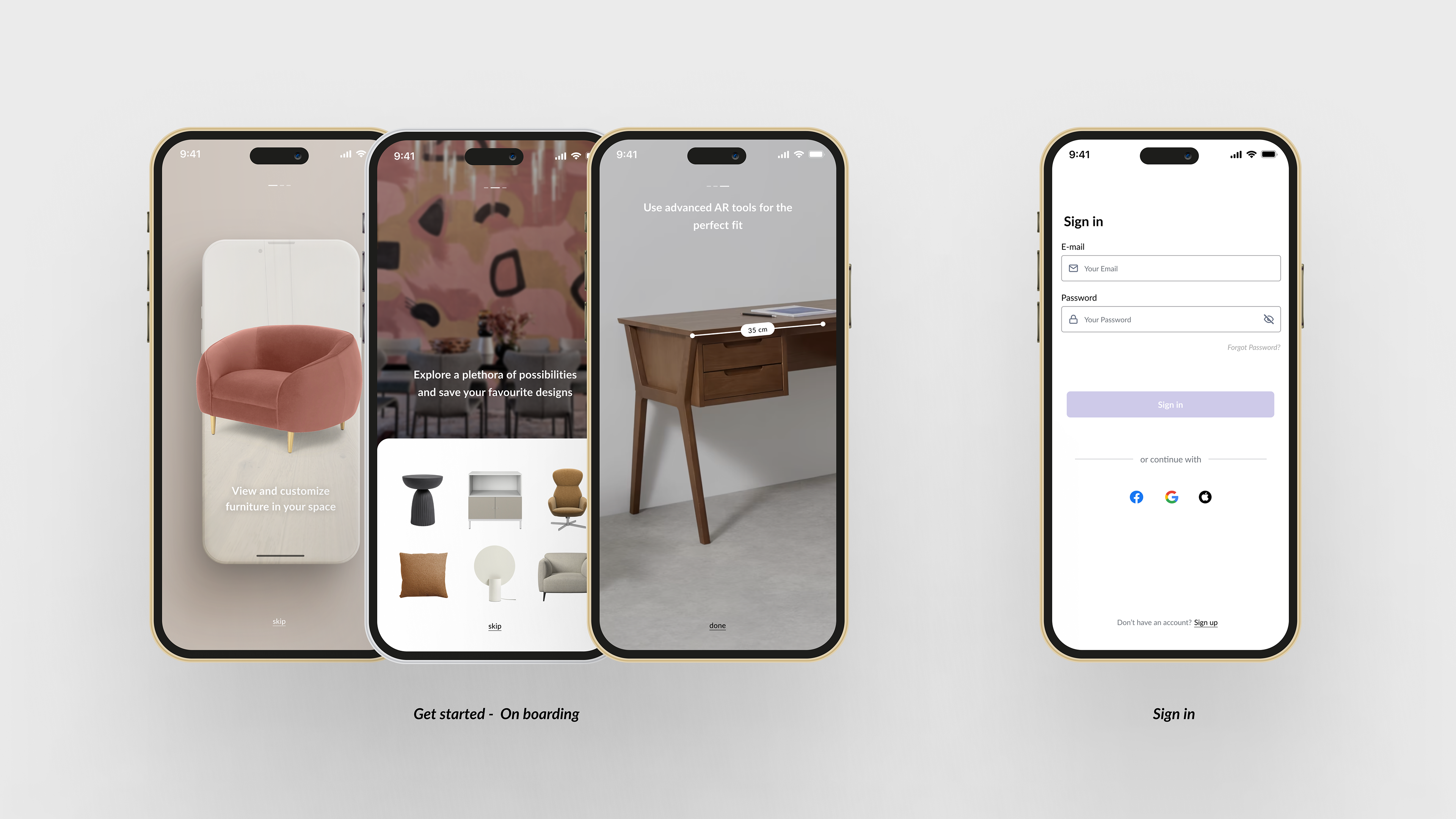
The main goal of the interactive prototype was to test the usability of the main features of the application and validate them and get feedback on the design of the application from users.
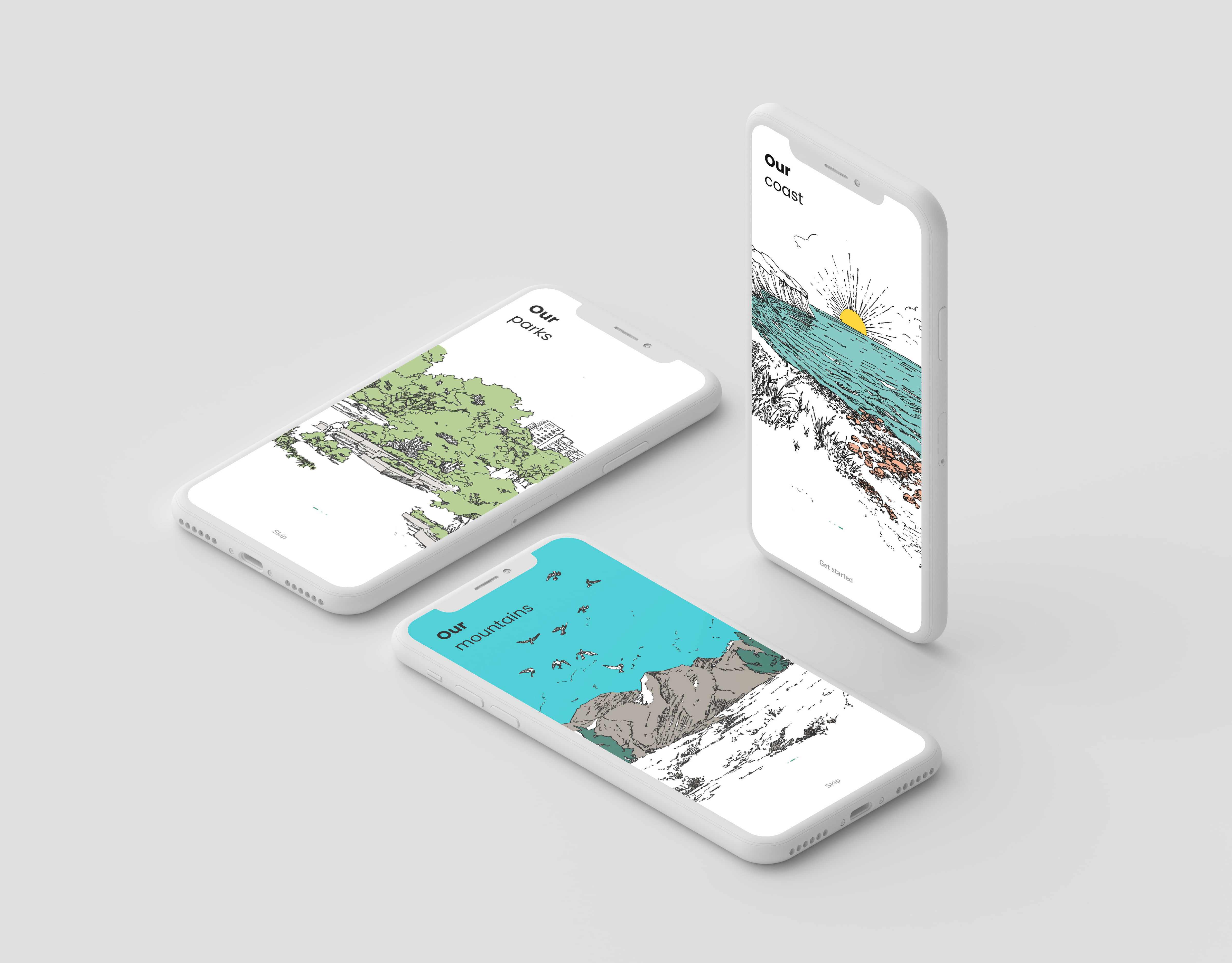
The onboarding pages in the prototype provide the users a preview of the main features including the ability to view and customise furniture in their space using AR, explore a plethora of designs, and use AR measuring tools to ensure perfect fit of the furniture.
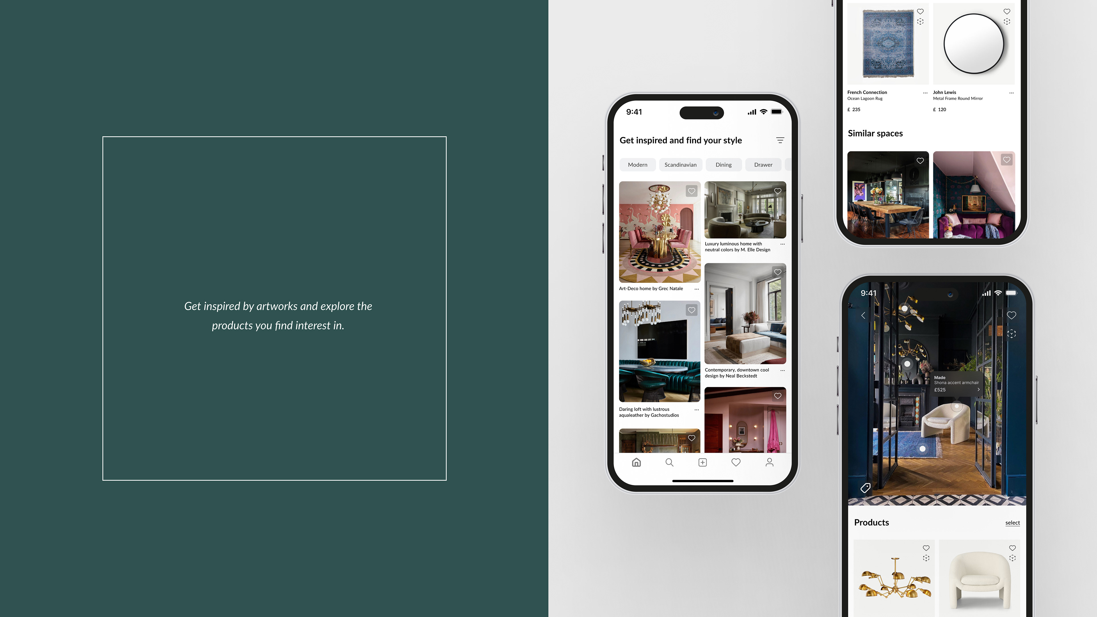
The homepage showcases a variety of artworks for inspiration. Each artwork has all its products linked within the application with the possibility to save to a list, view in their space and/or purchase directly.
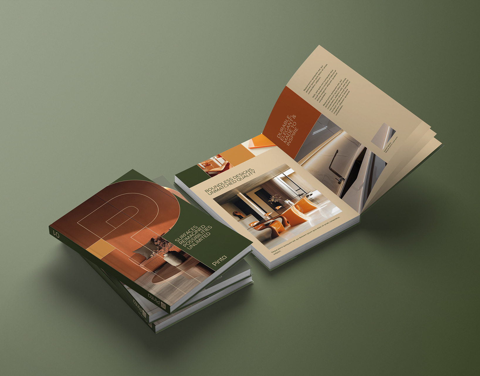
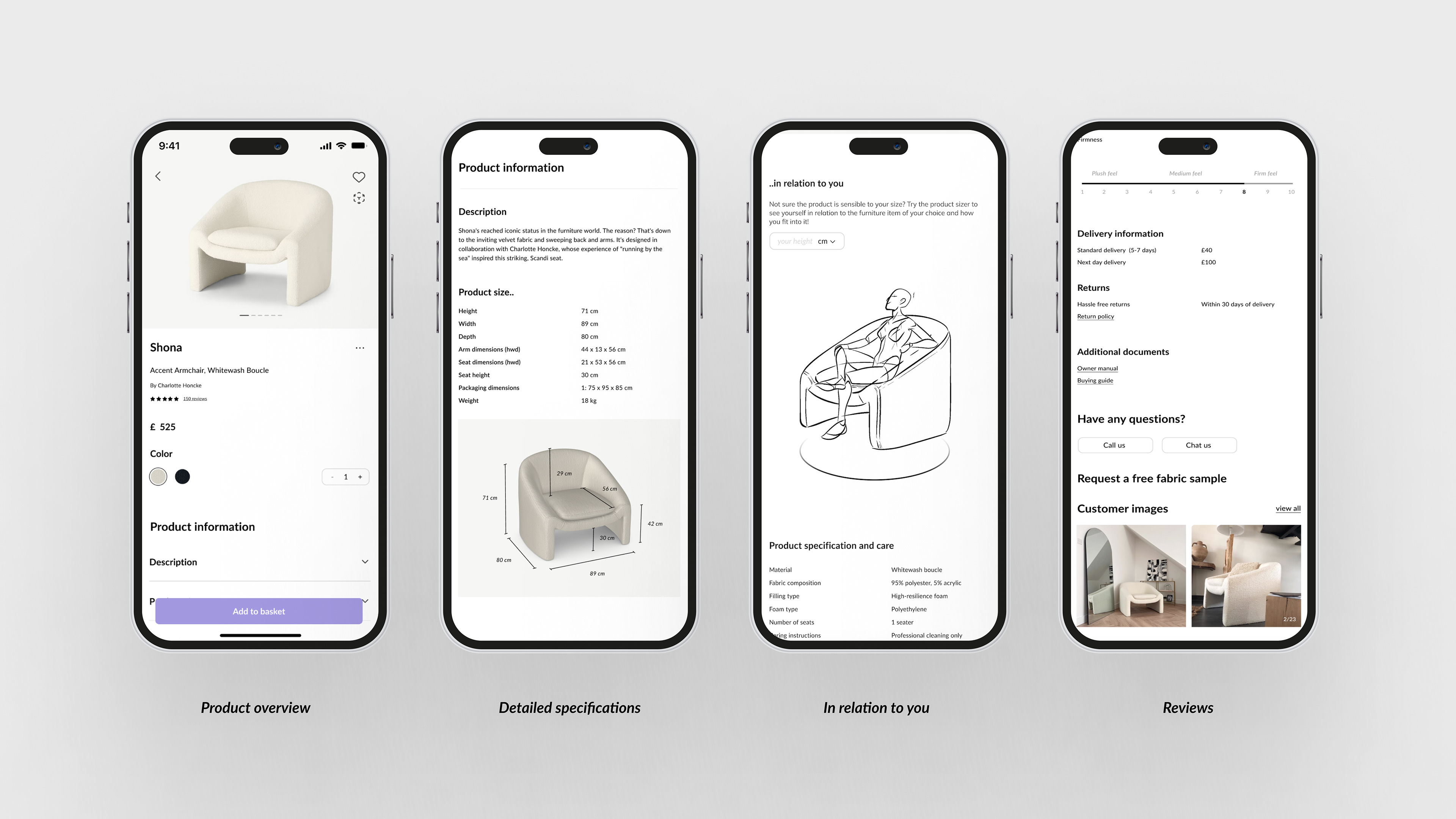
The product page aims to display very thorough information users have shown interest in during the previous stages of research. The main information is shown at the top along with high resolution images of the product, followed by an accordion menu allowing users to go through the information that is relevant to them without being overwhelmed.
The users can make more informed decisions by ensuring the product is a fit for their room and is sensible to their size by inputting their height; a 3D sketch is generated that would allow them to see how they would fit into a specific product.
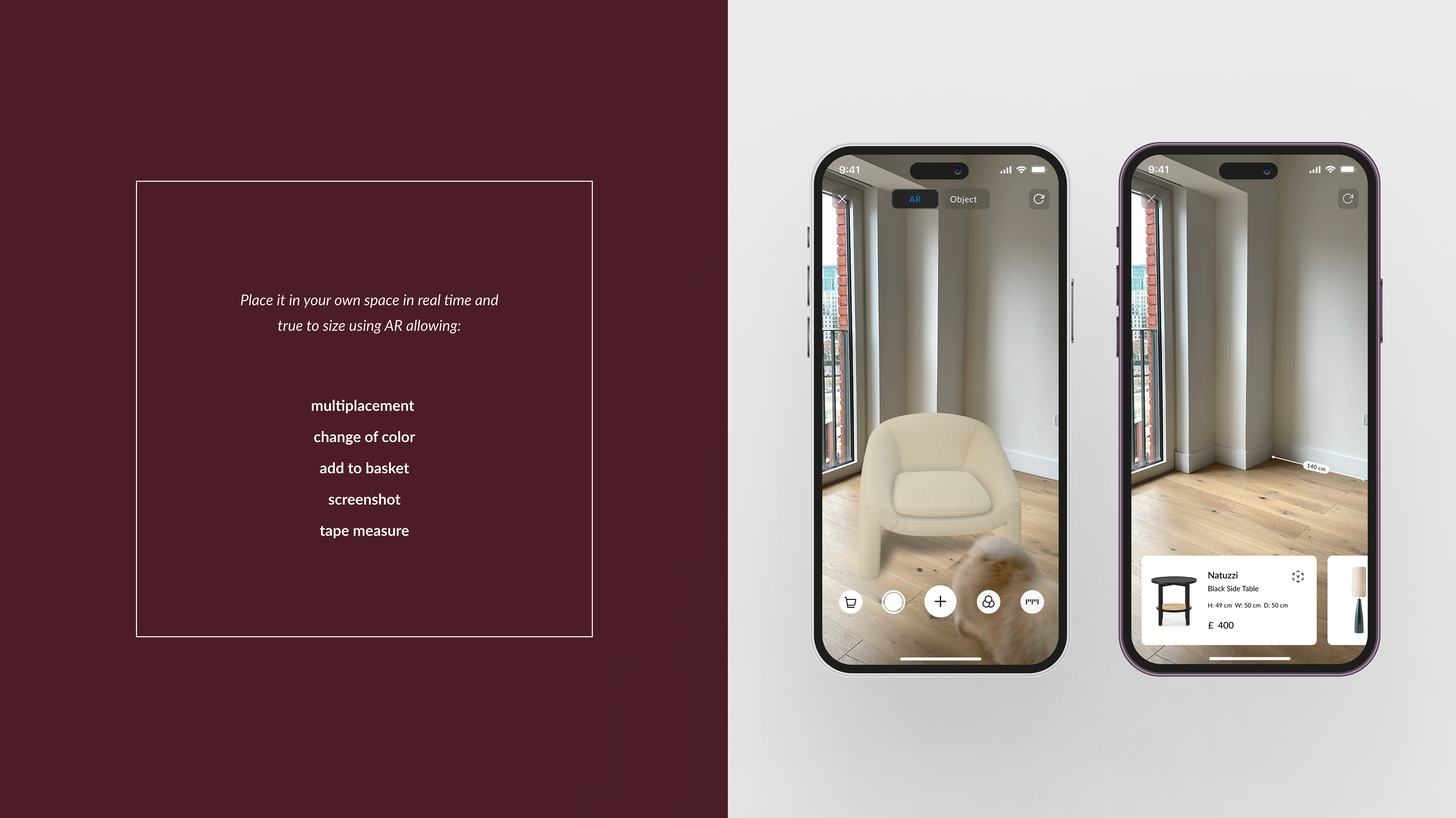
All products can be placed and customized in the users' space in real time and true to size using AR.
Users can also measure a specific space and get suggestions of products that would fit.
The search aims to be efficient and focused through the use of keywords, images and filters.
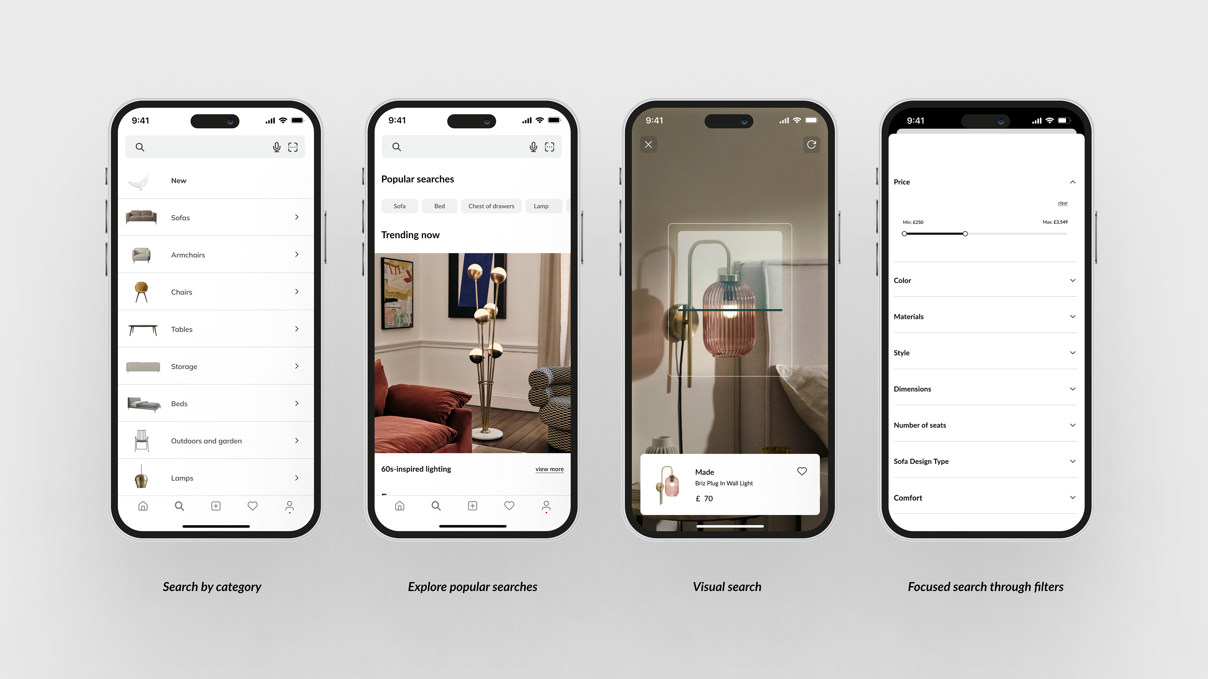
Users can compare the products of their choice side by side.
This page encourages users to revisit their previously decorated spaces and to build on their designs. They can add and/or remove more products into their space and customise them based on their preferences.
Users can also use static images from their photo gallery and/or templates and make them interactive by adding the desired products into their space.
Furthermore, this page allows users to use the AR tape measure and store documents of their choice such as floor plans.

Ideabooks proved to be crucial in all users' search for the right piece(s) of furniture. Users can save both artworks and products they like and get relevant suggestions based on the keywords used.

Obtaining feedback was vital to identify one or more problems. Four testing sessions were conducted following the 5 act interview, where the participants were greeted and informed of the project and the tasks.
Positive highlights:
· The onboarding is neat, the aesthetic is modern and colourful but yet not overwhelming with all the suggestions. It is eye pleasing and bold, giving insight on what the application is about.
· AR is innovative and might be scary as it is a new technology. However throughout the app, the user gets the hang of it and finds it easy to use. It is also very useful as it allows one to have a better perception of the space whether it’s in real time or using a picture.
· The information given about the products is very detailed, the possibility to compare is a very useful feature as well as sharing the comparison. The accordion menu allows users to read the information they need which is less overwhelming.
· Filters are very diverse, allowing users to find what they need in a short time.
· Measuring was found useful and easy and allows to find a well suited product.
Suggestions/ iterations:
· The suggestions coming up throughout the app are inspiring but might overwhelm an indecisive user.
· Possibility to seek help from professionals or other users.
· For future personas/behaviours, designers can showcase their work and get in touch with potential clients in order to build a community.